Game Nerd Breakdown
Irradiated by Stingray
Over on the book of faces, Tam posted a kill shot from our last raid night. Naturally, this brought all the nerds a-runnin’, and quickly derailed Tam’s victory pose into a discussion of game mechanics and a more meta discussion on interface design. So basically take this as warning that if you’re not into gaming or whatnot you may as well knock off here.
A commenter correctly observed that there appeared to be a metric shitload of information present on Tam’s display. Various players agreed that yes, in fact there was, and it got a bit conversational about how that information is managed, displayed, and how it scaled from zero to ALL THE THINGS. LabRat did a rundown of her interface, which caught on. I was going to do a rundown of mine, and then my browser crashed and ate about 1300 words worth of explanation, causing me to say many unkind things about many things before sobbing openly and starting over. Since it came out to such a firehose of gamer nerdism, I figured why not share it here.
This is a screenshot from in-combat, annotated badly because I suck at gimp. I’ll try to stay somewhat meta so what I’m looking at and why is more important than the game/class specific mechanic in game-terms. I play a rogue, a melee dps (damage-per-second) class. My entire raison d’etre is to pump out damage on the enemy. I have very limited ability to self-heal, and substantially less damage resistance than a tank (though broadly more than a healer), with a few tools available to mitigate incoming damage if used properly.
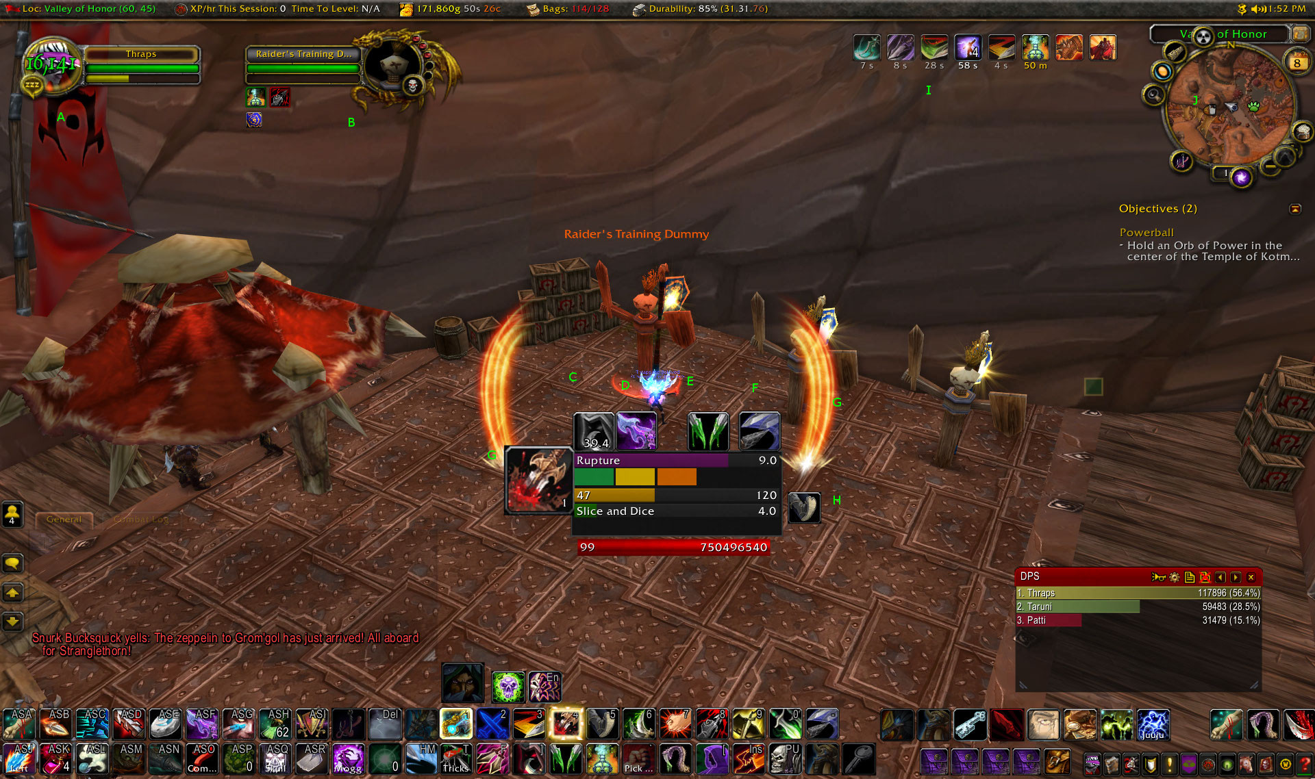
A is my unit frame. Mine is the game default because I don’t rely on it terribly much. Green bar is my health, green text is incoming healing. Fun fact, showing this shot to LabRat, neither of us had any idea where that healing was coming from and I had to look it up (turns out it’s a racial passive skill I’d forgotten I even had). The yellow bar is energy, my primary resource, also tracked by the yellow bar in the central box marked 47. Anything I do in combat consumes energy at various costs per skill, and it regenerates fairly rapidly over time on its own, sometimes aided by chance-based “procs”.
B is my target, a training dummy which is exactly what it sounds like. Also game default because the useful information I’ve replicated in more sensible/useful places and don’t care enough to change it there. The three red dots on its portrait’s right are combo points, more on those shortly.
C and D are cooldowns. These are things I can trigger to increase my damage output for a short time, which are then unavailable for a while. The greyed out C means it has been activated, and the 39.4 is how many seconds until I can use it again. Since D is in color, it’s available to use.
E and F are “Fix this, dumbass” indicators. E is present because in this shot, I have not applied a poison to my weapon, which is a major source of my damage output but only lasts an hour between applications. It can expire in combat, and if it goes unremedied all of a sudden I go from useful to burden. F means that the enemy has not had its armor weakend. There are multiple classes that can do this, including my own, but it needs to be done by *someone* so there’s an indicator up for me if nobody has done it yet.
G, both left and right, is a proc, a chance based event to let me use an attack at a reduced (free in this case) cost. The big ( ) slashes are the game default indicator, the stabby box is my redundant indicator because it’s a short window to take advantage of the proc and I really need to get on that.
H is whether or not my interrupt ability is available. This can stop an enemy from casting some types of spells, but has a short cooldown on use. It’s short enough I find it more useful to be a binary present/not present icon rather than tracking time till available like on C and D.
I is the list of buffs and debuffs on my character. In a group, this would condense down to a single box with an X applied out of Y available count for buffs available from other party members, but some proc-based ones such as the left-most four would still appear separate. Unmodified since I can’t control the proc-based ones, and they don’t impact what I’m actively doing in combat (other than the Really Big one at G), and the party buffs are dealt with before combat starts, ideally.
J is just my area minimap. Unmodified, but ringed by icons to access the settings for a bunch of the addons I run.
Coming back in to the central box on the screen, this is all of the most vital data I need to run combat. The bar marked Rupture is a timer counting down. This is an class specific ability I need to keep active on the enemy if combat is of any noteworthy duration. The bar marked Slice and Dice is likewise a countdown timer, but instead for a buff I apply to myself that’s a major source of damage output increase. The initial duration of both is determined by how many combo points, the green, yellow, and orange boxes between the timers, I have when I do it.
The combo points are my secondary resource. They’re generated by doing “builder” moves at the cost of energy. Five is the maximum, although there’s a player-choice mechanic to tweak that a little bit just for more complexity/flexibility depending on how you like to play it. These are spent with big burst damage moves called finishers. They don’t necessarily actually finish the boss, but it’s a big whack of damage.
The red bar with 99 then a huge number is enemy health in both percent form and total hit points remaining. I track it redundantly here because after it’s hurt badly enough, I get to use a different move as my combo point builder that increases my damage output. This phase of the fight is called “rush-down,” and happens at different points for different classes. During rush-down phases, bigger enemies tend to change their mechanics to become more dangerous with sort of desperation tactics. Not all classes get rush-down tools, but they’re huge increases to damage output for those that do.
Chat window is in the lower left, and the box marked DPS in the lower right is my e-peen meter. That tracks how much damage everybody in a group is pumping out either for a given fight or overall (it can track other metrics for other classes, too). There’s another meter that comes up when I am in a group fight that shows how much threat I have, i.e. how important the enemy considers me in priority for who to squish. Damage output is a major factor in threat generation, though far from the only one. Tanks get moves specifically designed to generate more threat than my raw damage output, but that isn’t to say I won’t pull threat from a tank if I just unload carelessly. Or intentionally, since it can be fun to annoy tanks if I think I can survive being the monster’s focus for a while.
While this whole thing is unique to me, perhaps the *most* individual aspect are the rows of buttons along the bottom. I use a keyboard with 18 macro buttons off to the left, and a mouse with another 12 aligned in a thumb-grid, and on my main character there, every one of them has a use. Those bars map all sorts of utility skills and spells for faster access than clicking them (which is still available as a redundant access to the tool). The bar with the buttons marked 1 through - are my most combat-critical things, though not sorted by numeric priority but a more organic process as I leveled the character, with a dash of standardization across all my characters (for instance 5 is *always* my interrupt button).
Finally, the bar at the very top of the screen is supplemental information: where I am, how much bag space I have, etc.
And this is what happens when I have nothing better to do in an afternoon than nerd out about warcrack. Which for all that complexity remains…. a game. I don’t think Pong had quite this many tweaks.

April 8th, 2014 at 3:16 pm
I haven’t played since Wrath, but since when did grid and a threat mon become “a metric shitload” of interface? I’m gonna get all Internet Old Man on everyone, but when I was healing MC, I had to have — [I just deleted all this stuff from memory, because I HAVE an old screenshot from MC.
http://phelps.donotremove.net/?p=958
THAT is a shitton of interface.]
I literally had a little vertical slit about 300 pixels wide that I used to move around. And frankly? I rarely used that. To keep my frames up, I spend most of my time with the camera pointed straight at the ground and zoomed in full.
That’s right, I fucking healed on instruments, relying on the minimap to stand in the right place. I was an IFR 40-man dwarf priest.
April 8th, 2014 at 3:31 pm
That is indeed one hell of an interface. The metric shitload is in the eye of the beholder though, and the commenter who kicked this whole thing off doesn’t play warcrack at all, so to the uninitiated the amount of info present on a max level raid screen will look rather shitloadesque. Yours doesn’t look too wildly different from my priest’s UI honestly, mine done in vuhdo and without the big patch of enemy frames.
April 8th, 2014 at 4:50 pm
Thanks! This was extremely interesting, and I am grateful for the time you spent writing it up.
April 8th, 2014 at 5:05 pm
Uhm, yeah. I had trouble moving from DOOMII to Quake with its up and down craziness. Clearly the chasm as only widened.
April 9th, 2014 at 1:59 am
Interestingly, this is more complicated than what I used in the RW to track and sink submarines with real weapons…
April 10th, 2014 at 9:10 am
As someone who played a rogue for many years, I like this ui a lot, although I probably would have moved the central info hub down a bit. I liked to have as much of the center of my screen empty for watching combat as possible.
April 10th, 2014 at 9:14 am
Also, the only reason my ui had fewer hotkeys was because I played on astandard kb and a 5 button mouse ;p I was always wishing I had more.
April 10th, 2014 at 11:02 am
I’d like it lower too, but in order to do that I’d need to move my special action button, which gets into cascading re-arrangement and rapidly crosses my “too much fuckaround” threshold.
April 10th, 2014 at 1:52 pm
Wyfraggro: These days blizz wants the prime UI real estate for it’s big purple special action button.
You have to shove your add-on reminders up in order to not accidentally cover that button’s reserved real estate.
April 10th, 2014 at 2:02 pm
Here is my UI.
Rather minimalist … the only real goodie is Ovale, which I keep off to the side a bit.
I use an Ideazon Fang gaming keypad, which does cut down on screen clutter.
April 12th, 2014 at 4:54 pm
So what’s the addons for the bar at the top and the central cluster?
April 13th, 2014 at 9:10 pm
The supplemental stuff at the very very top is Titan Panel, the main cluster in the middle is a custom config for WeakAuras.